menu


- Preface
- Introduction
- Tutorial
- Implementation
- Commands
- bitmap
- eval-wish
- get-tk-var
- photo
- set-tk-var!
- tk
- tk-id->widget
- tk-var
- tk/after
- tk/appname
- tk/bind
- tk/bindtags
- tk/caret
- tk/choosecolor
- tk/choosedirectory
- tk/clipboard
- tk/console
- tk/destroy
- tk/dialog
- tk/event
- tk/focus
- tk/getopenfile
- tk/getsavefile
- tk/grab
- tk/grid
- tk/image
- tk/lower
- tk/messagebox
- tk/option
- tk/pack
- tk/place
- tk/popup
- tk/raise
- tk/scaling
- tk/update
- tk/useinputmethods
- tk/wait
- tk/windowingsystem
- tk/winfo
- tk/wm
- Options
- Extensions
- Changes
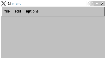
The menu command creates a new top-level window and makes it into a menu widget. Additional options may be specified on the command line or in the option database to configure aspects of the menu such as its colors and font.
A menu is a widget that displays a collection of one-line entries arranged in one or more columns. There exist several different types of entries, each with different properties. Entries of different types may be combined in a single menu. Menu entries are not the same as entry widgets. In fact, menu entries are not even distinct widgets; the entire menu is one widget.
Menu entries are displayed with up to three separate fields. The main field is a label in the form of a text string, a bitmap, or an image, controlled by the #:label, #:bitmap, and #:image options for the entry. If the #:accelerator option is specified for an entry then a second textual field is displayed to the right of the label. The accelerator typically describes a keystroke sequence that may be typed in the application to cause the same result as invoking the menu entry. The third field is an indicator. The indicator is present only for checkbutton or radiobutton entries. It indicates whether the entry is selected or not, and is displayed to the left of the entry's string.
In normal use, an entry becomes active (displays itself differently) whenever the mouse pointer is over the entry. If a mouse button is released over the entry then the entry is invoked. The effect of invocation is different for each type of entry; these effects are described below in the sections on individual entries.
Entries may be disabled, which causes their labels and accelerators to be displayed with dimmer colors. The default menu bindings will not allow a disabled entry to be activated or invoked. Disabled entries may be re-enabled, at which point it becomes possible to activate and invoke them again.
Whenever a menu's active entry is changed, a <<MenuSelect>> virtual event is send to the menu. The active item can then be queried from the menu, and an action can be taken, such as setting context-sensitive help text for the entry.
